
In attempt to try to get a feel for infographics, I did some research on Behance. As I should have guessed, there are so many cool infographics out there! People are so talented at illustrating information in unique and creative ways!
Jennifer Daniel does some really cool stuff in making politics and foreign affairs understandable (http://httpcolonforwardslashforwardslashwwwdotjenniferdanieldotcom.com/)


Nicholas Felton got in to infographics by making an annual report of his life. He got in the New York Times for it (how cool is that).


Paul Marcinkowski has done several infographics with a sharpie on people's bodies:

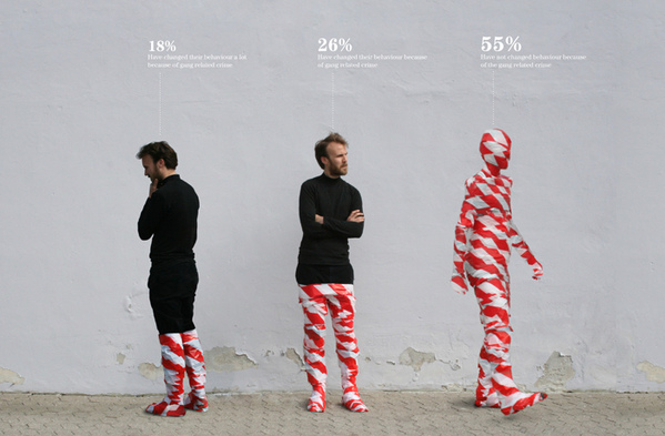
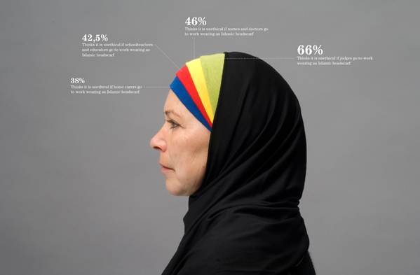
And Peter Orntoft makes really creative infographics using his information in context:

And who knew you could throw an infographic in motion? Check this clip out: http://vimeo.com/43457382#at=0
Inspiring? I think yes.
And with that, as I do with any project, I started some brainstorming in the sketchbook. And not to worry, there will be plenty of mind maps and word clusters to come. Being just around the corner, my infographic is going to illustrate KU basketball. Rock Chalk Jayhawk my friends.


No comments:
Post a Comment