Of all the ten layouts I created, this was my favorite one. I liked the simplicity of the composition but also how it conveyed the word's definition with precision and clarity. My classmates however didn't deem it quite as dramatic as I had hoped. My feedback was that the propelling L seeming to be condensing rather than flinging itself in the air. It was a statement I took to heart and if you keep reading, you'll find it revised in my next set of layouts.
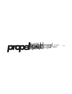
Before the critique, I didn't really like this one. I thought the jumbled up words was a cool concept but I didn't really think it illustrated the idea I was looking for. But Matt brought up the point that it looked like a rocket ship. Unintentionally, I had incorporated one of my preliminary designs (the one where I cut out the silhouette of the rocket) into this set of layouts. Weird how a concept can keep haunting you, but hey, maybe NASA will be impressed.
Again, with the propellers. I kind of spun off of my previous sketches and tried to illustrate the propeller on a boat rather than on a windmill or airplane. I didn't really like how it turned out but I knew I had an idea here and I was going to work at it to develop something that would take the viewer for a spin (Get it? Spin? Like the motion of a propeller? My apologies with the corny humor, it's an Iowan thing).


No comments:
Post a Comment